

Mobile-Friendly Website Design
Having a website optimized for the mobile experience is an absolute must have!
When your customers or prospects are on-the-go and want to find you, they look you up on their mobile phone. If your website is only optimized for a desktop/computer experience, you could potentially be missing out on business.
Here is why you need a mobile-friendly website
These days ,most of your customers have a smart phone. This means whenever they need you, they can look you up on-the-go. If they look you up and your website is only optimized for a desktop/computer experience, they’ll have trouble navigating your website because the formatting will be off.
If you don’t make it easy for users to interact with your website, or most importantly, find and contact your location, they will hit the back button and find some other business with a mobile-friendly site!
Having a cleanly-designed, mobile-friendly website for your business is critical because people are always have their phones on them. Have you noticed when people are in your restaurant waiting to be seated, they are on their mobile phone? That’s why you should be in front of them with a mobile-friendly website for your restaurant.
Another Reason To Have a Mobile-Friendly Website
Here’s an idea… say you have a special. 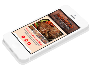 What if you had a sign in your business’ window or at the front desk that says “Check out our special on our website.”
Then they browser over to your website (on their mobile phone) and redeem the special using a keyword only found through on your website (let’s say… hot potato) which they only can find using your mobile site.
By making promotions easier for your customers to find, you can share special offers with them before they come to your business, which can ultimately help you sell more.
That’s just one idea. Rapid Media Marketing can help you ideate and piece together many more strategies. Call us today for a free evaluation! No cost or obligation!
For: Mobile website designs for your restaurant
 Thank you for taking the first step to a profitable online business. As you think about getting new clients or customers to your business, you need a step by step strategy that's proven to work. That's our specialty. By deciding to implement them today, you will begin getting new clients to your door. If you decide to hire us, you'll get our step by step systems that will net you more profits, or you won't pay! Here's How...You may want to click on our